The Design of Wine
· Peter Mitchell MW Peter Mitchell MW on
The following is an extract from our Spring fanzine, now available in stores.
With the theme of this fanzine centering on design, it had me thinking about wine labels. Whilst the contents of the bottle should always be the only thing that matters, the fact is that label design has a huge influence on much of what we buy. I have seen great wines fail to sell owing to terrible packaging and (more often the opposite, where poor wines fly off a supermarket shelf thanks to some nifty marketing.
Some of the world’s most revered classic wines have labels that are now seen as “iconic,” yet if looked at dispassionately they are pretty dodgy (I won’t name names!) whilst others do have designs that are elegant and timeless – Romanee-Conti springs to mind.
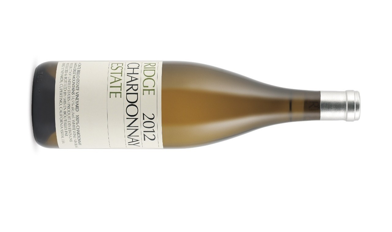
For me, one of the greatest label designs of the past 60 years belongs to Ridge Vineyards from California, but others will I am sure, have their own favourites. Having expert staff on hand to guide customers, we can afford to be less swayed by the packaging than most, but we all appreciate a good label.


